Tuesday, 21 April 2020

Week 6/7 - 3D model progression

Throughout week 6 and week 7 I bought more materials to build my living space from, as well rendering my 3D model o Fusion 360. By watching the tutorials videos on Moodle I constructed my 3D model of my living room. First I followed the videos exactly to learn and memorise the process. Step by step i watched the Russels tutorials baying close attention going back and forth so I wouldn't forgot the technique and shortcuts being made.


This was progress of my constructed practice model. Throughout the tutorials I noticed that when i finished a sketch for a particular side and clicking the button 'Extrude' I accidentally was selecting all the checkouts and not leaving the top and right side. Hence the corners were crossing over each other and not interlocking smoothly, as you can see in the pictures above (right and left corners) and below (left and right sides).


I learned from this mistake quickly though and tried my model again following the instructions completing it correctly. Once I finished my practice model correctly i was ready to attempt my model of my living space. I knew this was going to be difficult noting my living space had doorways and windows to include. With the skills and steps i just learned i slowly worked on each wall using the same principles.
To create the windows and doorways, I used the rectangle tool and drew the rectangle in the position I wanted it, this is the same technique I used to sketch the checkouts to interlock the model. Once the sketch was finished i just had to make sure I didn't select the feature when extruding the model.


Around this stage of the rendering, i noticed i had not started with a bottom piece to form up the sides on. I have no idea how i forgot this first step, but i knew if finished off one more wall i could draw the bottom on and then finish the last wall with the guide of the base.

The 3D model of my living room was finally taking shape and i was surprising myself with my memory as i continued to create. Drawing the bottom on was really difficult and slightly annoying due to the fact that this whole problem could of been avoided. The issue i faced was drawing the rectangles on the outside of the main base drawing and to align them with the opposite spaces of the checkouts, so that when i increased the thickness to 3mm it would slot into the right joints and not cross over and hit.
This was my completed 3D model, ready to be turned duplicated, aligned spread out evenly and ready to be put into Adobe Illustrator and made into a laser cut file.

Tuesday, 24 March 2020

Week 5 - model making

This week we watched videos of architectural model making, learning their use and importance in the design industry. this videos were actually very interesting and i was engaged the whole. the video gave great detail to proper materials and the effect each can have on different models.

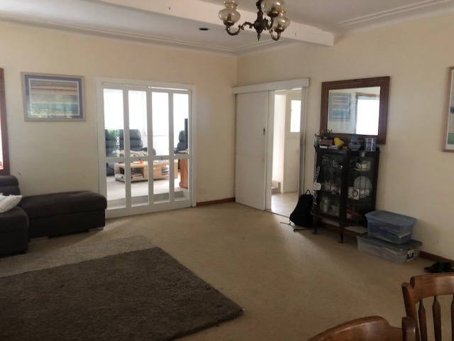
Our task for this week was to recreate a 1:10 scale model of the room where you spend the most time completing your uni studies. Instead of choosing my room i chose my lounge room. I didn't chose my room not only because i don't study in there but because it is too small and boring(only having my bed and bed side table in there. My lounge room is very big so instead of using 1;10 scale i decided to use 1:30 scale to allow it to fit on a A4 piece of paper.

First i took measurements of my lounge room, recording the heights, widths and lengths of the furniture, doors and actual room.


Once all the measurements were recorded i then used a scale ruler to map out the lengths and draw a floor plan on a piece of paper. I wanted to do this as well so had guide for when i was attaching the model piece to the paper.


Once this was done i used a empty Nurti-grain cereal box to use as cardboard walls. I used sticky tape and super glue to make the furniture and attached the walls. I also used scissors and a Stanley knife to carve out the windows. sticking the furniture together was really difficult and time consuming. In the end the model was to scale but did look a bit funny. Admittedly i know i could do a whole lot better if i was using proper materials and not cereal box cardboard. Overall though i thought i captured the room and its main features,


WEEK 4 activity and assessment update


For this week we watched detailed and informative videos of the differences between adobe Photoshop and Illustrator. In watching this i learnt how to distort my drawn images of the white house (a feature building within my area for the assessment). In the tutorial videos i learnt how to raise the contrast and blend the images i had drawn, adding on a cool effect for the finished result for the assignment.

Week 3 activity

For week 3 our task was to trace or given section in the campus and map out the geography of the space. By using one step as a rough measurement of 1 metre i was able to figure out how long every detail of my area was. By noting each measurement of every object i was then able to draw on grid paper a condensed version of my site, which would then be used for my Orthograph, for the assessment. I scaled my map to each square on the grid to equal 1 m. To the right is a photo of my finished drawing of my area.


I was no ready to use this scaled map as a guide for my Orthgraph. On illustrator was able to copy the same shapes for the building s and gardens to recreate the map. All i had to do after that was change the colours and show a pedestrian flow.

Monday, 2 March 2020

WEEK 2 activity - Adobe capture and Infographics


In our groups we were given tables of data for different things. This involved types of food, ranges of disciplines, ranges of transport etc. Within my group we were each selected a table of data and the task was to think of 3 words that come to mind when you think of the words supporting your statistics.
3 words : Futuristic, Sustainability, Creative
Then once you get 3 words describing this we search for images representing these words.
Creative image

Futuristic image

Sustainability image


Then on our phone i downloaded the app abode capture so i could create a "swatch' colour scheme. In doing this it gives us a platform to start on when deciding what colours to choose when making our infographic.


From those 3 colour schemes i liked the Futuristic swatch the best. The dark pink contrast to violet was a attracting concept for my infographic. For the infographic we were given the choice of a range (Mosaic, spider, pie chart). I went with to really show the blend of colours.


After showing this to my teacher, he gave me some advice and said that my colours were a little dark and not very bright for the viewers. He suggested I experiment with other colours from my other chosen photos using the adobe capture.


Using the eye drop tool of Illustrator i was able to use the exact colours from other chosen photo from the activity. I was more pleased with these colours and was thankful Russell and Daniel advised me to change. 

WEEK 1 ACTIVITY - photoshop.


During week 1 my group and I were allocated a location in the campus near the Whitehouse bar. We took photos covering a full 360 view from that particular spot, with these photos the task asked of us was to photoshop each photo adding in a picture of a object given to us in a moodle folder.


From this i choose the last photo in the sequence above, as i thought it would tie in well with my chosen photoshop image (Donald Trump walking).
I then went on to trace the photo of Trump, copying the outline of his figure and pasting it behind the girl walking. Making Trump the right proportionate size was difficult, especially because i had to get it looking real with the girl walking next to him. I wanted to add a shadow to make it more realistic but i couldn't figure out on Illustrator how to do and not making it look worse or fake.